portfolio
‘The times when we worked together have been the most successful in my career.’Andrea Ketzer, director application + middleware SW, Nokia
Since 2001 Peter Sikking has been designing interaction; creating new products, or revamping existing ones. Always the design lead, he worked solo, as team lead, or as consulting architect for large organisations.
Peter does not blink when large numbers are involved. Tens—or hundreds—of millions of users do not change the design challenges. A billion‐dollar turnover for a product of his design? —‘Cool.’
Below, a selection gives you a quick glimpse of his customers and work.
redefining the creative craft of font design, with global impact
overview
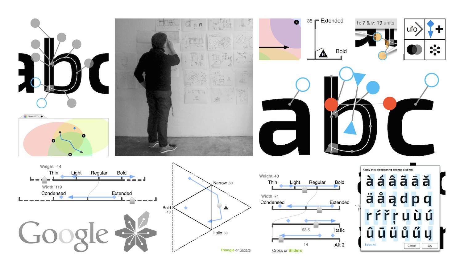
In 2014 Dave Crossland of Google fonts put together a team to realise Simon Egli’s vision for the future of font (family) design—as a professional web tool. The Metapolator project aims to significantly speed up font design, which is exceedingly needed in non‐latin type design.
Familiar with the work and reputation of Peter Sikking, Dave approached m+mi works to lead all interaction design work. Groundbreaking principles had to be embodied by the design; creative‐pro interaction and handling of complex font design projects had to be delivered in the web browser.
Peter says
‘The design process I installed turned this into a true product development project. Working in the open in the community built a whole new dynamic between us, based on a free flow of information.
‘This project needed and allowed for deep exploration of UI for working with complexity—e.g. 9‑D spaces, hierarchical rule systems—in a clear and simple way. The resulting industry‐leading interaction wowed the global font design community.’
Metapolator was an open project with online collaboration, designed at m+mi works’ studio with collaboration sprints in: Zurich, Valencia, Nancy (F), Fürth (D) and Berlin.
‘Metapolator, an open web tool for making fonts, is an impressive new product that addresses the problems of traditional font design tools.’UX and Design Weekly
making an impact on the daily lives of tens of millions
overview
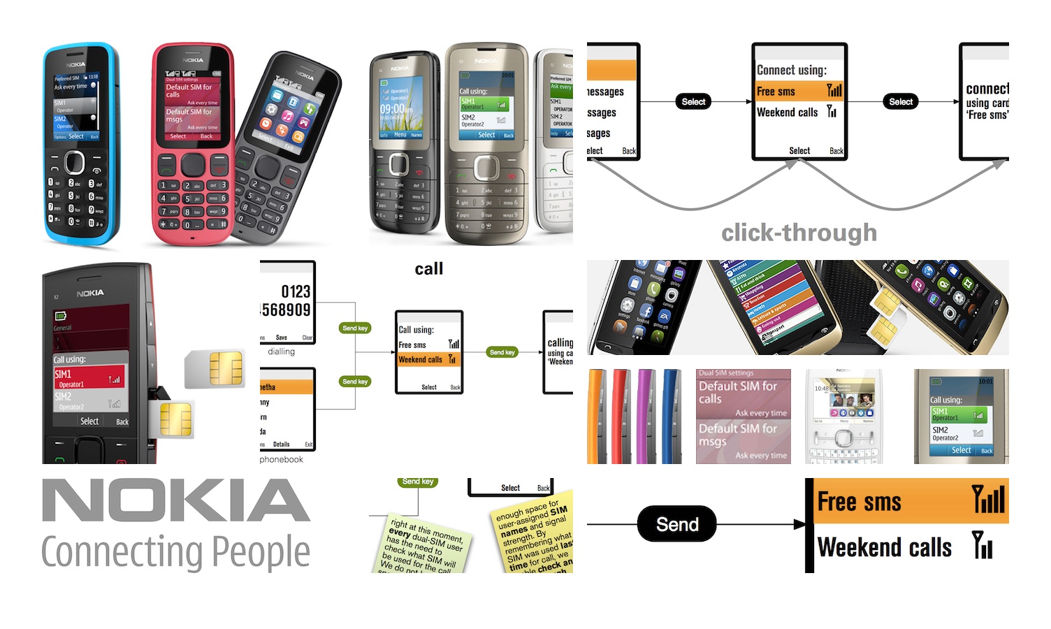
When Nokia developed their series of dual‑SIM phones for the BRIC and developing countries, they asked us to be interaction design lead. The impact of multi‑SIM handling on the UI and engineering of a whole phone is massive; a naive approach by less‐experienced interaction architects could render the project impossible.
Peter says
‘I structured all the UI work and designed the multi‑SIM UI patterns for the whole phone, securing project feasibility. I mentored Nokia designers and helped them solve the hairy design issues. The result is multi‑SIM handling that addresses users’ needs better than any other brand.’
Nokia dual‑SIM was designed at m+mi works’ studio, with collaboration sprints in Oulu (FIN), Copenhagen and Southwood (GB).
‘The times when we worked together have been the most successful in my career.’Andrea Ketzer, director application + middleware SW, Nokia
Nokia dual‑SIM phones turned over a billion dollars in their first three months in the market. You can read much more about it in our blog.
the essence of apps meets the essence of design: simply works beautifully
overview
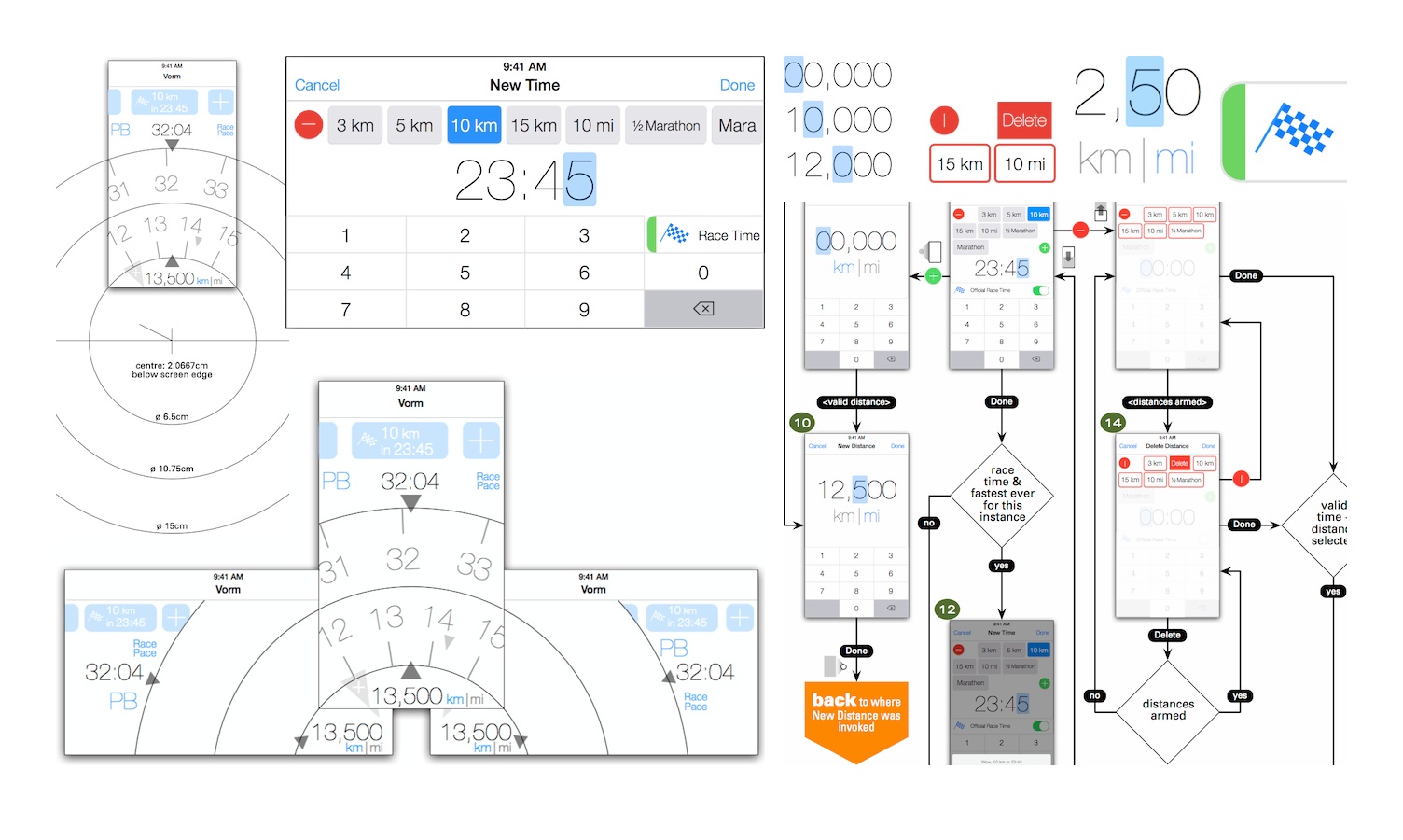
Peter has been designing mobile apps since 2002 and they can be found on half a billion mobiles. This one is special, because it is a personal app that was designed in the open. And that is why it is shown here.
The app is called ‘vorm’ and was designed for Chris Eidhof, developer extraordinaire and passionate runner. It is a race time predictor for serious runners, enabling them to raise their performance.
Peter says
‘Chris really dug the design process, how a structured process got the most out of our collaboration and how the collaboration clarified his vision and plans for the app on many levels.
‘With the app being so to‐the‐point (as they should be) and Chris such a kick‐ass developer, I took the opportunity to design truly enchanting interaction. That started with analysis of what makes touch UI such a joy, and resulted in custom rotors for the main interaction.’
vorm was designed at m+mi works’ studio, with collaboration sprints in Berlin.
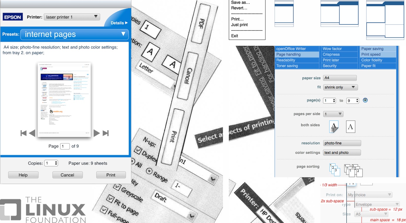
pure infrastructure: designing printing for every user
overview
openPrinting is Linux Foundation project that keeps printing working for all linux users. The vision is ‘printing that just works.’ Like all things infrastructure, that sounds like a matter of course, but in 2006 linux printing wasn’t working. As the world’s largest printer manufacturer said: ‘the state of these print dialogs is costing us money.’
Initial usability research by relevantive had shown that just on the user side, complexity already mushrooms uncontrollably. Established research and analysis did not work. So they called in m+mi works.
Peter says
‘This was my first experience with infrastructure; I learned how in many ways, it is in a league of its own. First lesson: structuring the design work is make or break for the whole project. I transformed a complexity of billions to a defined process involving seven distinct designs. I also added users’ needs to the mix, which seemed to have been a first for the printer and printing industries.
‘One final note: imitation is the sincerest form of flattery. It is cool to see our innovative designs turn up on other operating systems.’
openPrinting was an open project with online collaboration, designed at m+mi works’ studio with associate Kate Price, and collaboration sprints in: San Francisco, Siena, Tokyo, Montréal, Lexington (US) and Berlin.
You can read much more about openPrinting UI design in our blog.
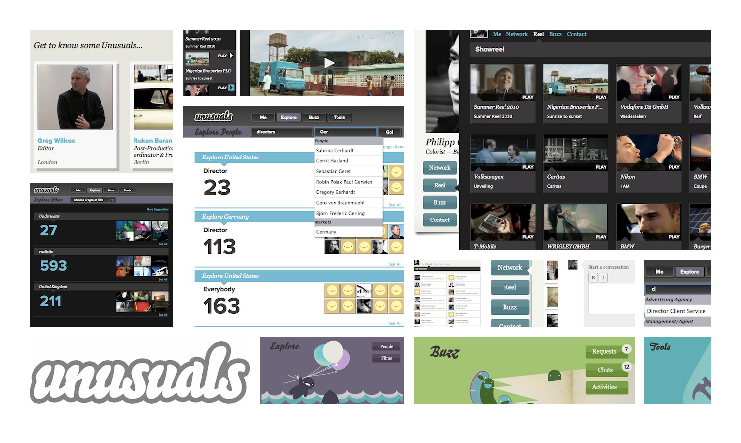
a community for creative pros
overview
unusuals was a startup in Berlin that ran the online network for advertising film professionals.
For their relaunch they asked m+mi works to help them with heavy interaction design issues—e.g. visualising a global social network; or combining search, exploration, film world dynamics and much more in one single interface.
Peter says
‘I put together a consulting package that fits the special needs of startups. I structured the UI process and with the unusuals crew built a sound basis to make the necessary feature‐priority choices. Working closely with the creative director, I solved UI design issues and helped them to realise their ambitions.’
unusuals were consulted at their office in Berlin.
You can read an extensive project rundown in our blog.
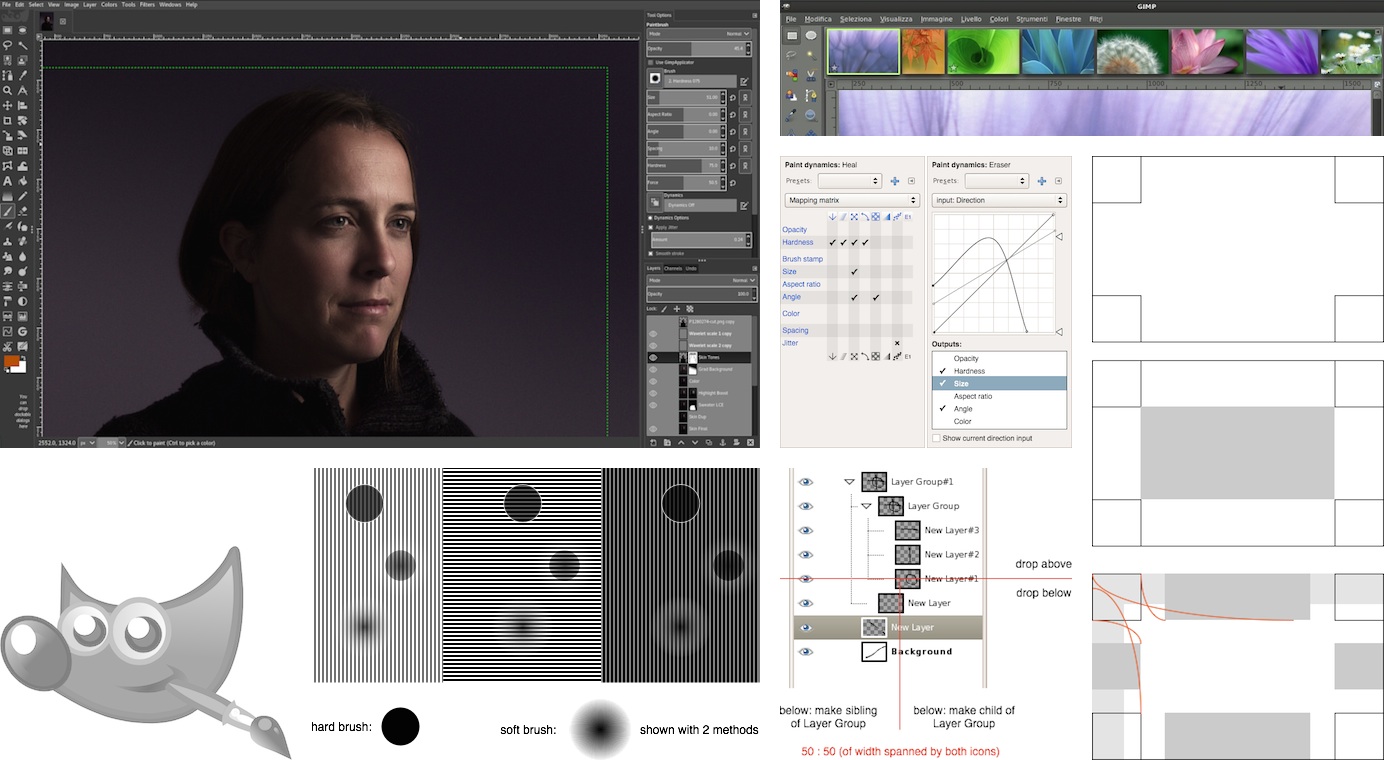
notorious GIMP, a reference for great interaction design? hell yeah, read on
overview
GIMP is the open‐source photo—and image—manipulation program. It is made for intense use and has more than a million users. In 2006, GIMP’s state was typical for a tool for creative pros: a glut of features and atrocious usability. It had become notorious in this regard.
The project leadership realised that something was really amiss with building what users asked for and what developers felt like. They reached out, via the pioneering openUsability initiative. After a series of conversations, they invited m+mi works to joint the project.
Peter says
‘Over the course of eight years, I led all interaction design work, either working solo, or leading a small team. Being fully immersed in the project, contributions ranged from hands‑on solving detailed UI for developers—via (re‐)designing tools and modules, and specifying them—to architecting an overall UI revamp.
‘Online designer–developer collaboration was pioneered and refined. Industry‐leading paint and graphics tools were designed and shipped. Topics that were poisoning the community–developer relationship (single‐window interface, CMYK) were tackled through design, with results that wowed both parties.’
GIMP was an open project with online collaboration, designed at m+mi works’ studio with several associates, and collaboration sprints in: Montréal, Istanbul, Lyon (F), Essen (D), Wrocław (POL) and Berlin.
You can read much more about GIMP UI design in our blog.
‘GIMP has a UX team lead by Peter Sikking (of m+mi works) and they have been making steady progress in improving the UI. Honestly it’s pretty darn good now.’Máirín Duffy, principal interaction designer, Red Hat, on opensource.com
‘Peter, thanks a lot for the work you have done for the GIMP. I have enjoyed learning about the thought processes behind usability work and it has broadened my view on these issues a lot.’Simon Budig, GIMP developer
‘Thank you GIMP project and thank you Peter Sikking for your hard work.’Christopher Bohman
‘Thanks for your work Peter, it has been instructive for me.’Michael Muré, GIMP developer
‘Peter did everything he could to change the way things worked, and he did an admirable job.’Jack Wallen, techrepublic.com
‘I have referred to the GUI specs at gui.gimp.org frequently, I will continue to do so, and thank Peter for all the work he has done.’Michael Schumacher, GIMP community manager
‘As an avid GIMP user and a long‐time admirer of the improvements in the UI, thank you for all you have done.’Nate Hoy
‘Your work on GIMP has been an eye‐opener for me. Watching you work in the open was very instructive and a rich source of inspiration. Thank you for all that generous sharing.’yahvuu, GIMP contributor
- info@mmiworks.net
- +49 (0)30 345 06 197
- imprint